Monday, 4 May 2015

Week 11 Reflection (Hi-fi Prototype)

Week 11 was a chance to reveal my newly constructed high-fi prototype of StudyMate. As discussed in last week's blog entry, I had gone with a green and blue background, along with two main typefaces; Myriad Pro and American Captain. Prior to the class, I had tested my prototype myself and on a number of my friends, and had already received feedback and made observations myself on what could be improved. Therefore, I was looking forward to seeing if these observations would be confirmed my by classmates.

A number of classmates tested my application and gave me feedback. Unsurprisingly, one of the elements that was picked upon was the bottom bar of icons in the application. This bar had been made rather quickly, and I was already planning to overhaul it. Hearing the same feedback by my fellow classmates was the final bit of confirmation I needed to make this change.

Another thing that was noted was my choice of background. Although the green and blue had originally been suggested by some of my classmates, once they saw it in the application, their minds changed. Some comments were that the gradient of bright green and blue decreased legibility, making it harder to read the screens. This is certainly a problem that can be encountered with bright or complex backgrounds, as noted by Hanson (2003). A couple more opinions were that the background was too 'tacky' and unprofessional, while others said it wasn't warm and welcoming enough. This was an interesting and valuable piece of feedback. When designing a user interface, the designer is aiming to design a certain user experience. The experience I was aiming for was a welcoming, accommodating, helpful experience. Therefore, learning that my background didn't give this experience was very valuable, as it gave me direction into what should be changed in StudyMate to give the user the desired experience.
My first prototype, showing the green/blue background and bottom icons

My current version of StudyMate, using a warmer yellow background and a revamped bottom bar of icons


References (APA)

Hanson, V. (2003). The user experience. ACM SIGCAPH Computers And The Physically Handicapped, (76), 4-5. doi:10.1145/1036401.1036402

Tuesday, 28 April 2015

Week 10 Reflection (Designing for Experience)

Following on from last week, this week we brought our InVision prototypes to class for some preliminary testing. Considering that we had only had one week to learn our way around InVision, we were only expected to have our original wireframes uploaded and working in InVision. I had this completed, so I was looking forward to getting feedback on my application.

Upon testing my rough layout of StudyMate (my application) on fellow students, I quickly confirmed my own thoughts on what could be improved. I had an open mind, as Glanville (2007) said, one should always consider the notion of leaving room for continuous improvement. The need for a 'confirmation' popup was cited, as it was too easy to accidentally exit a study session. Furthermore, I questioned the students on what colour scheme they would like to see in StudyMate. I received suggestions of green and blue, as they are bright colours, but still look 'professional' if used correctly. I therefore began producing a high fidelity prototype in class.

Starting work on my high fidelity prototype got me thinking - I had my basic layout (from the wireframes), but had no clear direction on how to design StudyMate from an aesthetic point of view. Therefore, I opened a couple of applications on my phone and navigated around them, trying to observe why they've made certain decisions. I observed the use of plain backgrounds, usually just a solid colour or faint pattern. This is to ensure that the background doesn't distract from the text and buttons, and doesn't clash with them either. With these considerations in mind, I began designing StudyMate with a green and blue background.

References (APA)


Glanville, R. (2007). Designing Complexity. Performance Improvement Quarterly, 20(2), 75-96.

Sunday, 19 April 2015

Week 9 Reflection (Information Design)

This week was a bit different, as Raghu was sick so our tutorials were cancelled. However, this didn't stop the week from being productive; we were instructed to sign up for InVision and to construct a basic prototype using our wireframes we had constructed for Assignment 1.

After signing up for InVision, I watched some basic tutorials to learn how to use the application. Following this, I uploaded my wireframes from the first assignment to see if I could create an interactive version of my application. Upon uploading them, I realised one important thing - I should have cropped them beforehand so that they fit in the screen. I noted this and went about adding the interactivity into my application. Once it was finished, I tested it myself. This was interesting, as it was much quicker to use than the paper prototype had been - instead of flicking the pages, I could click on a page and instantly navigate there. This made me think about the need for confirmation popups. For example, when deciding to finish a 'study session' in my application, all one has to do is click on the home button. However, what if a user accidentally tapped on that button and therefore left their session by accident? Confirmations are important, as they prevent users from accidentally doing damage or making their task more difficult (Lidwell, Holden & Butler, 2003)

References (APA)

Lidwell, W., Holden, K., & Butler, J. (2003). Universal principles of design. Gloucester, Mass.: Rockport.

Tuesday, 14 April 2015

Week 7 and Class Free Week Reflection (Project 1 Feedback)

For week 7 we were finishing our projects and getting feedback. For me, this week was a continuation from the previous week - in week 6 we constructed low-fi prototypes out of paper. During the period between our class in week 6 and week 7, I tested this prototype on more people and tallied the results. This was interesting, as I learnt how different people respond to the prototype. For example, the application was designed for university students, so I found that many of my test subjects (who were all uni students) responded similarly. Therefore, I decided to test my prototype on a number of subjects who were not in my target user group (just out of interest, not as a test that would be noted in my results) and found that they responded in a different way. The individuals I tested my prototype on were over 40 years old, and therefore had less knowledge about navigating applications. None of these subjects owned a touch screen smartphone themselves, and therefore had not adapted to navigating around such a device. Therefore, these subjects had more difficulty using the paper prototype, as they are not used to the conventions that such applications use. In fact, there has been research done to show that there are physical and behavioural traits that older adults share that affect their computer skills such as failing eyesight, poor muscle coordination, overly cautious behaviour and slowed learning rates (Hutchison, Eastman & Tirrito, 1997).

This displayed to me how important it is to design a user interface for a particular group. Different target groups have different requirements, and it is instrumental to remember this when designing the user interface for a product aimed at said group. In the case of this assignment, designing a basic application for university students wasn't too difficult, as I am a university student myself. However, I can see that if I was to design a product/application for a target group vastly different to myself, it would require a lot of research into that groups specific needs.

References (APA)

Hutchison, D., Eastman, C., & Tirrito, T. (1997). Designing User Interfaces for Older Adults. Educational Gerontology, 23(6), 497-513. doi:10.1080/0360127970230601

Tuesday, 31 March 2015

Week 6 Reflection (Lo-fi Prototype)

For week 6, we were set the task of creating a lo-fi prototype of our application. This came in the form of a paper prototype, as can be seen below. The idea behind this prototype was to create wireframes of the different screens that may appear on our application, to allow us to test it on potential users. The actual prototyping itself was rather straightforward, as we simply drew up wireframes on paper. However, the testing proved to be rather more interesting.

One of the screens from my paper prototype
When I tested my prototype on fellow classmates, I wasn't sure what to expect at first. I assumed there would be a large amount of criticism and suggested changes, but this wasn't to be. In fact, the large majority of my test subjects had no suggested changes to make; they felt the prototype application was easy to navigate as it was. This was inspiring and very useful - it was enlightening to see how such a simple process could give such valuable feedback. Of course, there were some suggestions for minor changes I could make, and I took all of these on board and considered them for refining my idea. The whole process was extremely helpful and taught me the value of prototyping before attempting to implement a design. Zigmond (2011) pointed out the importance of ethical guidelines in a profession, saying that they must be kept 'alive, relevant and effective'. One of these ethical guidelines stood out to me; to 'design for all'. Testing my prototype on others helped me keep my design relevant and effective, as instead of designing it specifically for myself, I received feedback from others.

References (APA)

Zigmond, M. J. (2011). Making Ethical Guidelines Matter. American Scientist, 99(4), 296-299.

Sunday, 22 March 2015

Week 5 Reflection (Demographics, Psychographics and Personas)

This week we focused on the user. A design should center around the user (hence the term 'user-centered design'), as it ultimately requires their approval to be successful. Therefore, defining the user is instrumental to prototyping and refining a design. Defining the user is a process that requires considerable thought and research. Ultimately, it also leads to a good usable design, as explained by Claxton:

"The essence of good design is usability, which requires the study of users' behavior to accurately assess product performance." (Claxton, 2008)

As we learnt this week, this can be done through defining the age demographic of the user, the psychographic of the user, and creating personas.

In order to create my solution for the assignment, I considered who my users are. Defining demographics and psychographics were relatively straightforward. However, creating personas required more thought, but ultimately was the most useful. I created a detailed persona about a fictional university student who could be a potential user of my design. This gave me insight into exactly what type of user would be a candidate for my design.

Persona I created for this assignment
One thing I gathered from this process was that it is much easier to create a persona after defining the demographics and psychographics of potential users. This narrowed down the field considerably, and gave me context to work from when creating a persona.

References (APA)

Claxton, B. (2008). The significance of user-centered design. Mobile Radio Technology, 26(7), 16.

Sunday, 15 March 2015

Week 4 Reflection (User Expectations and Needs vs. Wants)

For this week, we focused on the users needs and expectations. Specifically, we applied this to our assignments. Before the tutorial, we were required to consider whether there is a need for our proposed idea, and the requirements of the idea.

When preparing these points, I thought in depth about needs vs. wants. My idea was for an application that would help university students study. Studying is certainly a problem among uni students, as I identified from questioning a number of students. However, to address this issue, what does the user want, and what do they need?

A list of my issues and potential solutions
Product requirements for my application
Many students may want a quick fix, something that does the work for them and that they rely upon. However, this is not what they need; this would not be helpful in the long term. Therefore, there is a tricky balance that must be achieved. Listing the requirements of my application helped. For example, one of my requirements was that the application must be encouraging, not discouraging or commanding. This process of listing the requirements helped greatly in finding the fine line between what the user wants, and what they actually need. This idea of conducting preliminary research in order to identify the problem should apply to just about every profession and even to daily life (Nagurney, 2007).

References (APA)

Nagurney, A. (2007). The Importance of Research. Chronicle Of Higher Education, 53(22), B18.

Wednesday, 4 March 2015

Week 3 Reflection - (User Centric Design and Requirement Gathering)

This week heralded the start of our first assignment - to come up with an application that would aid students in university life. In preparation for the tutorial, we were tasked with coming up with 3 problems and 3 solutions in relation to the task.

Finding three separate problems might sound easy on paper, but actually required some thought. I found myself asking 'what is the hardest thing about university?'

In the end, I came up with three problems, simply by examining my personal experience and by interviewing fellow students. Focusing on three ideas rather than a multitude was helpful, as it allowed me to make sure each idea was refined and of good quality. Briggs (2010) says that the goal of ideation is not to necessarily come up with a large quantity of ideas, but to come up with quality ideas. I also learned that this is a form of requirement gathering, and thus discovered why it is so important. Without using this step first, it would be easy to lose direction and focus - what is the problem I am attacking here? It's absolutely vital to clarify the problem first, and then go about finding a solution.

Finding an idea for a solution was also not very straightforward. Again, whenever I came up with a potential idea, I questioned myself - would I be willing to use this idea to assist in university life? This really highlighted to me just how important it is to keep the target market consistently at the forefront of your mind. A brilliant idea must be one that engages with the target market - otherwise it would be a flop. Again, this is another example of requirement gathering; one of the most important requirements for a user centric design is the engagement of the user. If this requirement is not satisfied, the end result will more than likely be a failure.

References (APA)

Briggs, R. O., & Reinig, B. A. (2010). Bounded Ideation Theory. Journal Of Management Information Systems, 27(1), 123-144.

Tuesday, 3 March 2015

Week 2 Reflection - Good and Bad UI

During this week, we examined what makes a 'good' or 'bad' user interface. I found this an interesting topic, as we have all stumbled across a clunky, terrible application or website, and often take the well designed ones for granted.

The lecture for the week finished by instructing each of us to find an example of a good user interface and a bad one, and to justify our reasons for thinking so. I thought back to what I could use as an example - I've had many experiences with good user interfaces, but I really had to rack my brains to think of a bad one.

One instance came to mind - earlier this year I was booking plane tickets for a trip to Europe, and thus had to use an online travel agency. One of the websites I intended to use was an absolute nightmare - the pages were hard to navigate, with items being laid out in an unorthodox fashion. The pages were incredibly long, requiring a large amount of scrolling to get through a whole page. This is something that should be avoided when designing a good user interface, as noted by Sethumadhavan (2013). While this was annoying, the most fundamental flaw made itself apparent when I attempted to enter my name, as displayed on my passport. The required field had a 20 character maximum, meaning that people with long names were unable to enter their full name! Unfortunately, I could not remember the specific travel agency, so I decided to go with a different option.

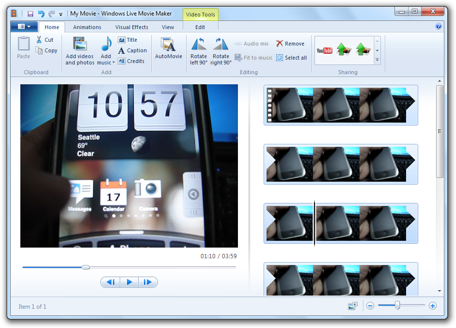
Eventually I decided on Windows Movie Maker - specifically, comparing the old version (good user interface) and the new version (bad user interface). Without going into too much detail, the new version was an example of a bad user interface as it had been over-engineered - the programmers had 'reinvented' the program to such an extent that it was missing important features and was a nightmare to navigate around.
The old Windows Movie Maker, who's interface is based off professional video editing software
The new Windows Movie Maker
This got me thinking - often when designing user interfaces, too much emphasis is put on the visual appeal of the interface. While aesthetics are important, ease of use and functionality should be a higher priority. This was displayed perfectly through the new version of Windows Movie Maker - while it may look more streamlined and modern than the old version, functionality has been sacrificed in favour of this.

References (APA)

Sethumadhavan, A. (2013). Principles for Designing Good User Interfaces. Ergonomics In Design: The Quarterly Of Human Factors Applications, 21(1), 33-33. doi:10.1177/1064804612471791

Intro Post

Welcome to my blog! I am Steven Rummukainen, a student at the University of Canberra, and here I will be posting about all sorts of things to do with User Interface and Experience.