During this week, we examined what makes a 'good' or 'bad' user interface. I found this an interesting topic, as we have all stumbled across a clunky, terrible application or website, and often take the well designed ones for granted.
The lecture for the week finished by instructing each of us to find an example of a good user interface and a bad one, and to justify our reasons for thinking so. I thought back to what I could use as an example - I've had many experiences with good user interfaces, but I really had to rack my brains to think of a bad one.
One instance came to mind - earlier this year I was booking plane tickets for a trip to Europe, and thus had to use an online travel agency. One of the websites I intended to use was an absolute nightmare - the pages were hard to navigate, with items being laid out in an unorthodox fashion. The pages were incredibly long, requiring a large amount of scrolling to get through a whole page. This is something that should be avoided when designing a good user interface, as noted by Sethumadhavan (2013). While this was annoying, the most fundamental flaw made itself apparent when I attempted to enter my name, as displayed on my passport. The required field had a 20 character maximum, meaning that people with long names were unable to enter their full name! Unfortunately, I could not remember the specific travel agency, so I decided to go with a different option.
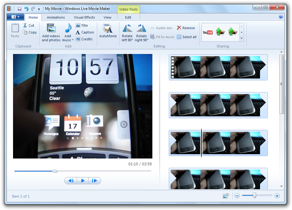
Eventually I decided on Windows Movie Maker - specifically, comparing the old version (good user interface) and the new version (bad user interface). Without going into too much detail, the new version was an example of a bad user interface as it had been over-engineered - the programmers had 'reinvented' the program to such an extent that it was missing important features and was a nightmare to navigate around.
 |
| The old Windows Movie Maker, who's interface is based off professional video editing software |
 |
| The new Windows Movie Maker |
This got me thinking - often when designing user interfaces, too much emphasis is put on the visual appeal of the interface. While aesthetics are important, ease of use and functionality should be a higher priority. This was displayed perfectly through the new version of Windows Movie Maker - while it may look more streamlined and modern than the old version, functionality has been sacrificed in favour of this.
References (APA)
Sethumadhavan, A. (2013). Principles for Designing Good User Interfaces. Ergonomics In Design: The Quarterly Of Human Factors Applications, 21(1), 33-33. doi:10.1177/1064804612471791